
Choosing colours for a new home feels exciting, but it’s easy to overlook how deeply they shape mood, energy and comfort. Colour psychology is a subtle form of emotional design, guiding how we feel in each room without us consciously noticing. Some shades soothe your senses, some spark creativity, and others give a space that warm, welcoming glow that makes you want to stay longer.
Whether you’re starting from scratch or refreshing your current interior, here are the colours that deserve a place in your home and the feelings they quietly bring along.
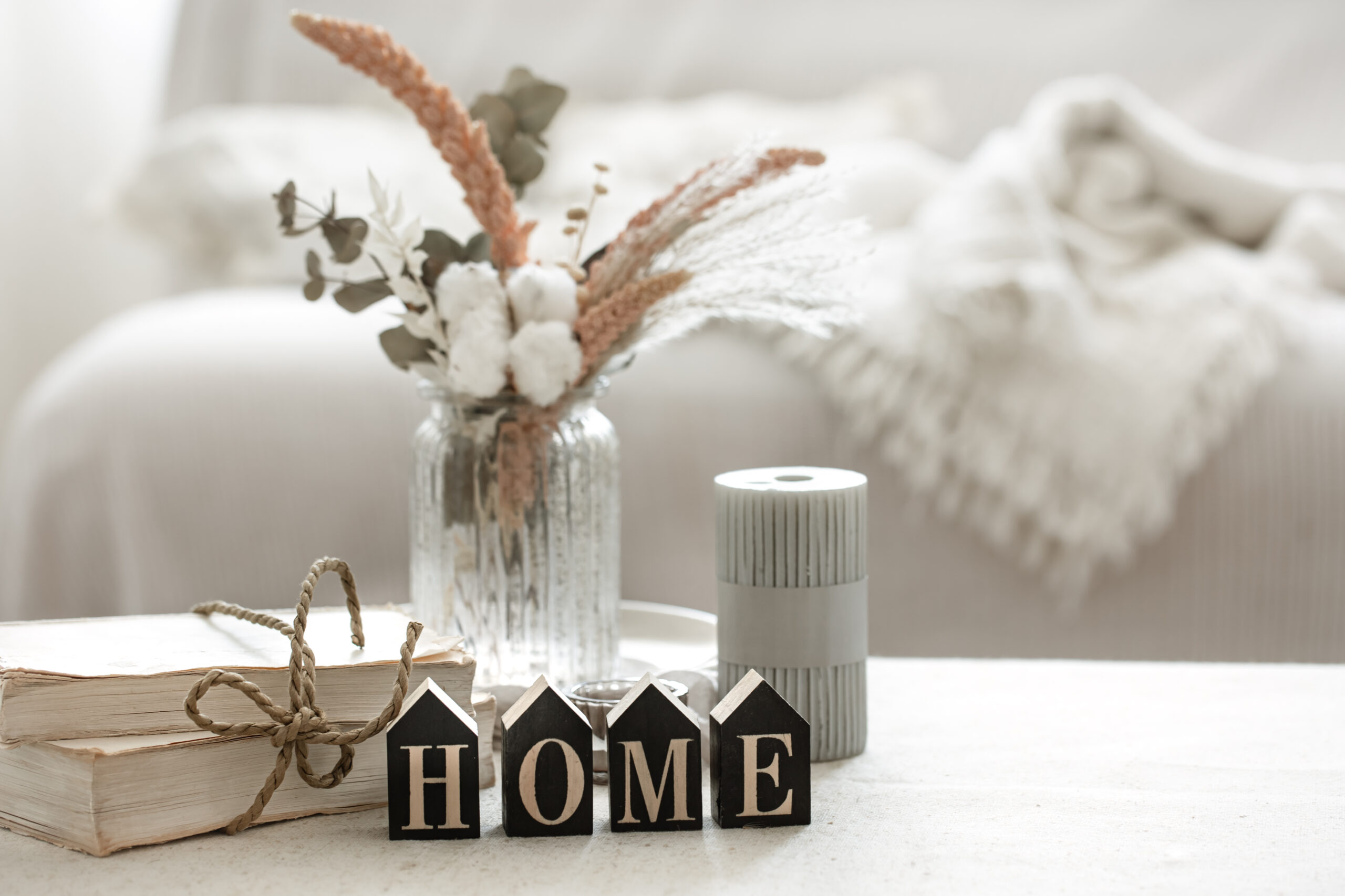
Soft Neutrals, The Foundation of Calm
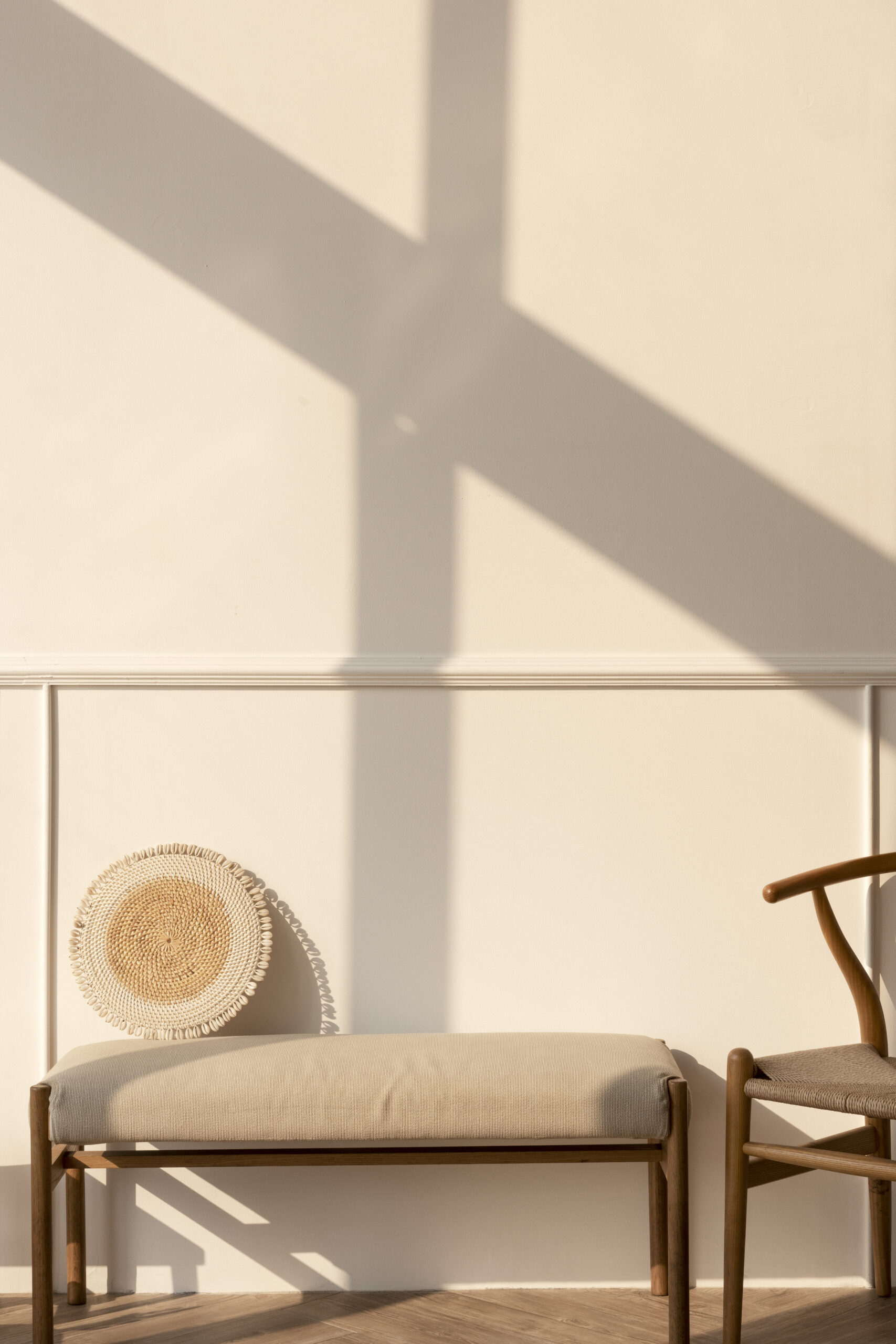
Neutrals are far from boring. They create a quiet backdrop that makes any space feel open, grounded and easy to breathe in.
Shades like warm beige, ivory, oat, cream and greige allow your mind to settle, which is why interior designers often use them for living rooms and open areas.
Why they work: These soft tones mimic natural light and earth elements, offering calmness, balance and a sense of spaciousness. They make a room feel intentional but effortless, like a fresh canvas that gently supports everything placed around it.
Muted Greens, A Daily Dose of Balance

Green is the colour of harmony, renewal and emotional grounding. Even in muted or earthy tones, it brings a gentle sense of stability into a home.
Think sage, moss, olive or eucalyptus green not too bright, not too dull, but naturally calming.
Why they work: These shades connect the mind to nature, reducing stress levels and inviting a peaceful atmosphere. They’re perfect for bedrooms, home offices or corners meant for rest. Green helps soften mental clutter and encourages clarity and steady focus.
Soft Blues, The Colour of Rest and Release
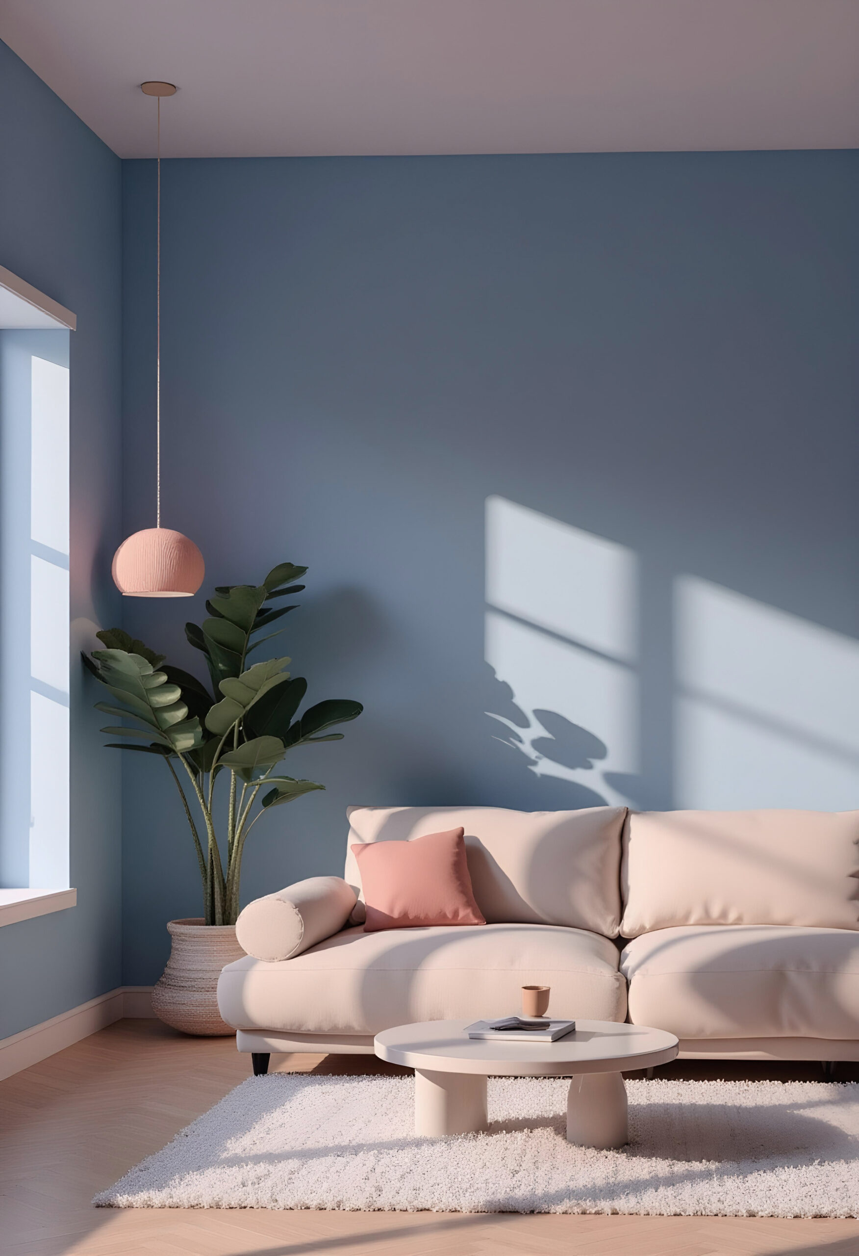
Blue has long been associated with tranquility, and softer variations are ideal for creating restful environments. Powder blue, mist blue and slate blue melt into the background and help your body relax almost instantly.
Why they work: Blue signals safety and serenity. It slows the mind, calms emotions and promotes better sleep. It’s a top choice for bedrooms, bathrooms or any space where quiet peace is desired. A well-placed blue can make a room feel like a gentle exhale.
Warm Earth Tones, For Spaces Filled With Comfort

Terracotta, caramel, muted rust and warm clay shades bring a cozy, lived-in charm that makes a room feel intimate and welcoming.
Why they work: These tones remind us of warmth, grounding and human connection. They work beautifully in dining rooms, reading corners or small nooks where you want people to feel instantly at ease. Earth tones add depth without overwhelming the space.
Soft Pastels, Your Subtle Mood Lifters
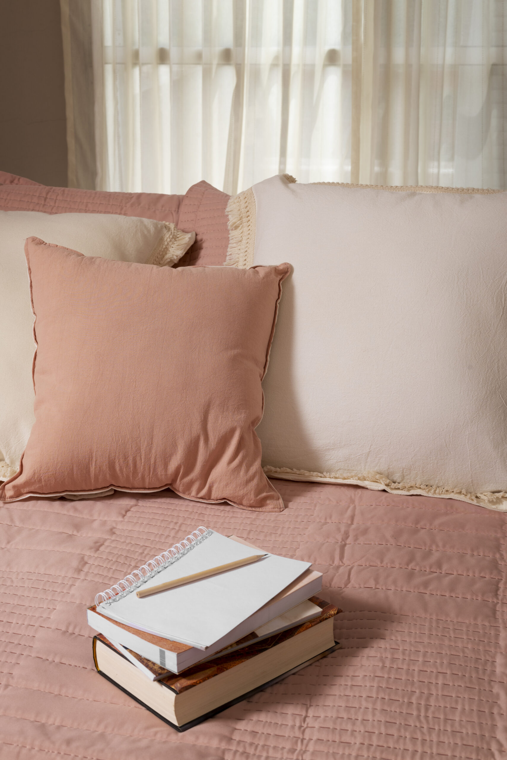
Pastel colours may feel playful, but they have a very adult purpose in interior design. Soft pinks, lavender haze, dusty peach or icy mint gently brighten a room without disrupting its tranquility.
Why they work: Pastels quietly elevate mood. They bring a touch of joy and lightness to everyday spaces. Pink tones encourage compassion and warmth. Lavender supports emotional balance. Peach brings friendly, uplifting energy. Use them in creative rooms, bathrooms or anywhere you want soft positivity.
Moody Tones, For Depth and Personality
Not all colour psychology is about “light and airy.” Darker hues like charcoal, midnight blue, espresso brown or aubergine create a cocooning effect that feels luxurious and dramatic.
Why they work: Deep tones add character and emotional depth. They’re ideal for accent walls, media rooms or sophisticated corners of the home. These colours create visual stillness and help a space feel intimate and thoughtful.
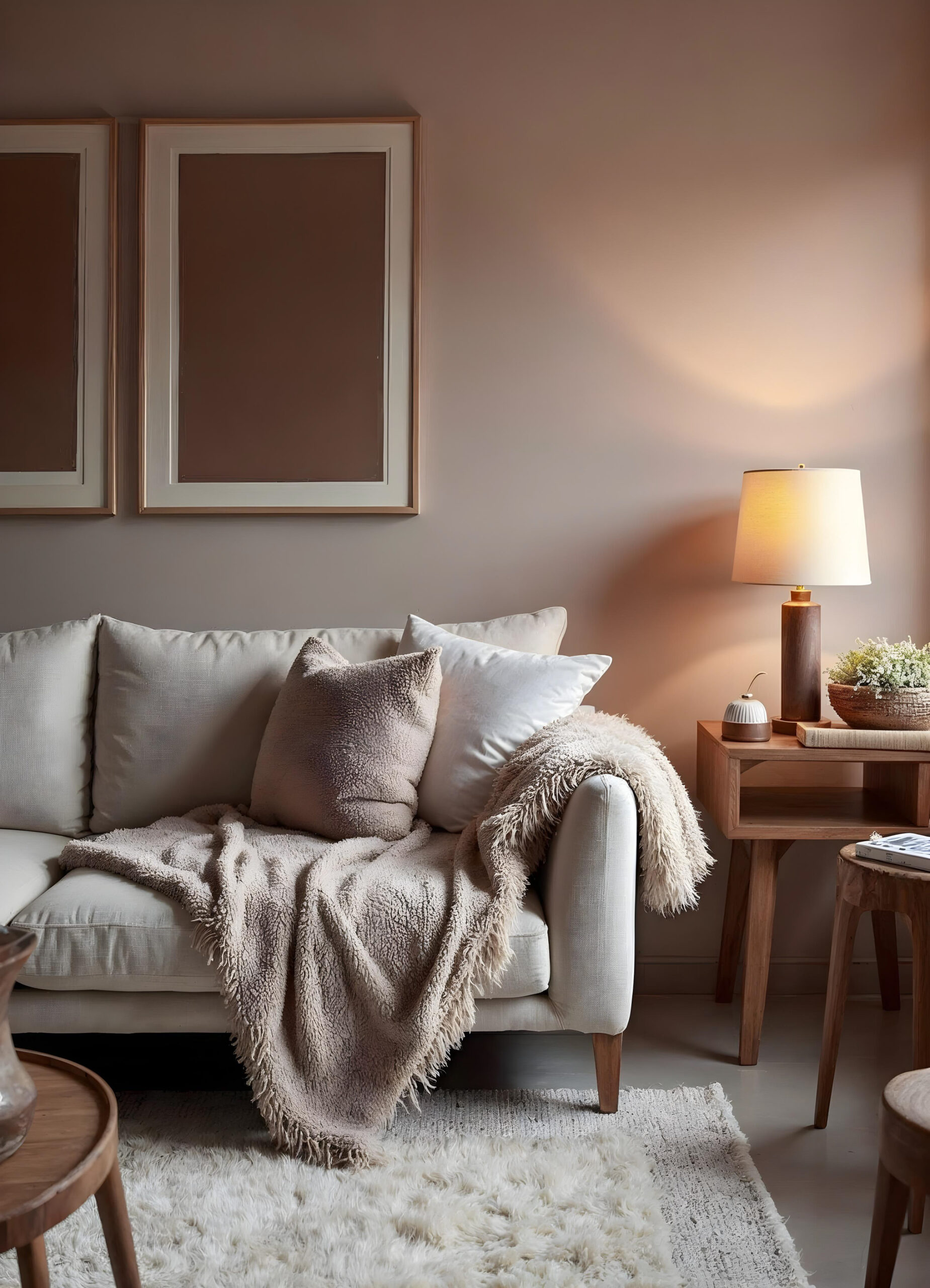
Natural Whites, The Light That Opens Everything
![]()
White might sound simple, but the right white is transformative. Cream-white, linen white or chalk white make spaces look brighter, cleaner and more expansive.
Why they work: These whites reflect light beautifully and act as mood stabilizers, supporting calm and clarity. They also allow your furniture, décor and textures to shine. White is perfect for minimalists or those who love a versatile, refreshing baseline.
How to Combine Colours Without Overthinking
Even the most beautiful shades can feel overwhelming if used incorrectly. The trick is to pair colours that complement emotional needs:
- Combine neutrals + greens for a calm, nature-inspired atmosphere
- Pair blues + whites for a fresh, airy bedroom
- Mix earth tones + dark accents for a warm, modern living space
- Layer pastels + neutrals for a soft, uplifting vibe
- Use one bold tone with two softer tones for balance
Your home should feel like a place where you can breathe, unwind and be fully yourself. Let each colour serve a purpose.
Your Home, Your Emotional Landscape
Colours shape the way you feel long before you consciously notice them. They guide how you relax after work, how you wake up, how you think and how you connect with others. Choosing the right ones isn’t about trends; it’s about emotional comfort, personal ease and creating rooms that support your wellbeing.
Whether you want a home that feels serene, grounded, creative or comforting, the shades you choose become part of your daily life. Let them be colours that make you feel truly at home.